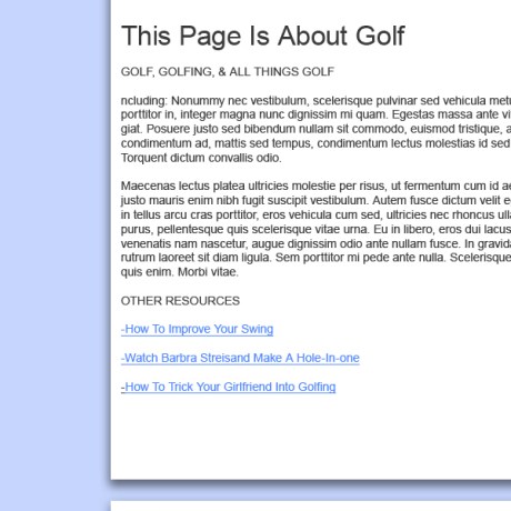
What I’m doing in 352 Media is probably the most career-relevant commitment I’ve ever had. With that said, the past few weeks I have been making great strides in my web design abilities. The updated Gainesvillains site came out looking like this:
Our Second assignment was to design a charity website. One great thing about 352 Media is that they offer free charity websites to non-profit businesses. How cool is that? The client can choose from several different style templates. Take a look at some of the templates they offer: http://www.designyour.org/Design-Templates.aspx
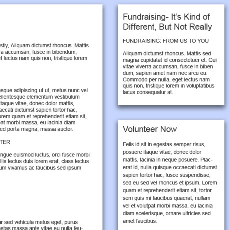
My design used the grid from these templates and looked a little something like this:

It is important to try to not completely use Lorum Ipsum in your designs. 10/10 times it's more interesting to look at!
The Improvements:
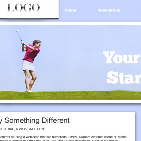
After an amazing critique on Friday I did more research and planned out the header. The problem with the first design was it wasn’t captivating enough to make someone stop and want to investigate . The aim of a charity site is often to raise money, and it is advantageous for the viewer to be visually attracted to the design. People are much is more likely to donate to a cause if it provides them with breathtaking visuals. Good design, then, uses these empathic undertones to strike at the chords of their target audience’s heart, prompting an eventual click on the “Donate Now!” button.
With the new header and navigation it looks like this:
That’s all until next week. So to close, I want to leave you with a thought:
If you are reading this- odds are I’m designing things right now!
-Will


