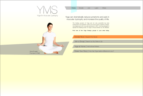
So far we’ve made fun websites, charity websites, learned to slice and code a site from PNG, and learned a TON about web design and usability. In the past week, we made another charity website. My final two charity sites are below:
Our new design project involves creating a tab for the 352 Facebook Page- a way for people to apply for an internship online, straight from facebook. Because of the small amount of space, this project presents the opportunity for some really cool information design to take place. Here’s some examples of my first swing at it.
 The idea would be that the area on the left would be a variable area where content shifts depending on the tab or section selected on the right. After getting feedback from Adam and the other interns, the following elements need to be changed:
-the font needs to fit in with 352 branding (Sketch Rockwell!)
-the imagery needs to fit in with 352 branding (colors & graphics)
-the application needs to not look like facebook, it blends in too much
-usability may be an issue, the application is intended to be easy and straightforward
After the past week of work, we took a much-needed break for Thanksgiving. Upon our arrival we further critiqued our Facebook applications. Another intern, Nick, has a very good, although long and slightly drawn out, application which inspired me to rework mine from the ground up. Here’s what I ended up with:
After seeing about the program and reading how to apply, applicants can select their tab at the top to learn more about their specific track and apply for that track. All the steps are on one page in a linear, straightforward format. I feel like this design solves the problem of the application process being too complicated or drawn out. We’ll see what they say in critique!


