Archives for category: Will’s 352 Media Internship

It has been quite a semester. The skills and concepts I learned from working at 352 Media Group this semester were extremely valuable and relevant to my growth as a designer. Constructive criticism has never been taken so well. Learning a new design form is difficult, because while it incorporates lots of things you already know, there are many design elements you don’t know. So I made a lot of mistakes. But in our group critiques we spent hours each week analyzing our designs, learning and growing together.

Sound like something YOU want to do? Apply here!

There are also tons of resources on the web for web design inspiration that were shared with us. The one I found myself browsing the most (thanks to my awesome supervisor,  Adam Davis) was Dribbble.

http://dribbble.com/

Dribbble is a website where designers post ‘what they’re working on’ and collaborate and share designs, ideas, and trends. Use it to push yourself to the next level!

Here is a final overview of all the designs I created this semester for 352.

Gainesvillains blog redesign:

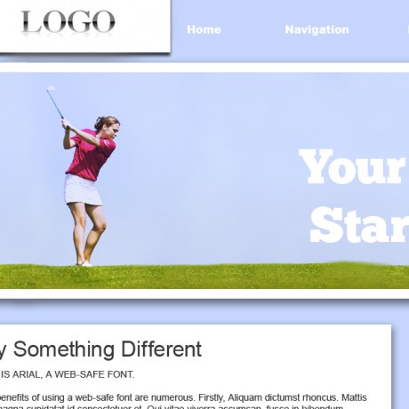
Golf Charity (321 Swing!):

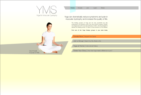
Health Charity (YMS):

Facebook Application Design:


That’s all for this semester with 352 Media!

They are a great company and I encourage anybody interested in Web Design, Marketing, or Programming to apply. Until our sweet facebook applications are implemented- you can learn more and apply online here.

So far we’ve made fun websites, charity websites, learned to slice and code a site from PNG, and learned a TON about web design and usability. In the past week, we made another charity website. My final two charity sites are below:

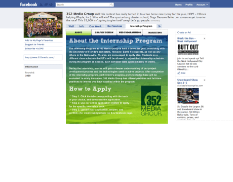
Our new design project involves creating a tab for the 352 Facebook Page- a way for people to apply for an internship online, straight from facebook. Because of the small amount of space, this project presents the opportunity for some really cool information design to take place. Here’s some examples of my first swing at it.

The idea would be that the area on the left would be a variable area where content shifts depending on the tab or section selected on the right. After getting feedback from Adam and the other interns, the following elements need to be changed:

-the font needs to fit in with 352 branding (Sketch Rockwell!)

-the imagery needs to fit in with 352 branding (colors & graphics)

-the application needs to not look like facebook, it blends in too much

-usability may be an issue, the application is intended to be easy and straightforward

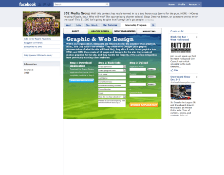
After the past week of work, we took a much-needed break for Thanksgiving. Upon our arrival we further critiqued our Facebook applications. Another intern, Nick, has a very good, although long and slightly drawn out, application which inspired me to rework mine from the  ground up. Here’s what I ended up with:

After seeing about the program and reading how to apply, applicants can select their tab at the top to learn more about their specific track and apply for that track. All the steps are on one page in a linear, straightforward format. I feel like this design solves the problem of the application process being too complicated or drawn out. We’ll see what they say in critique!

What I’m doing in 352 Media is probably the most career-relevant commitment I’ve ever had. With that said, the past few weeks I have been making great strides in my web design abilities. The updated Gainesvillains site came out looking like this:

Click to view larger image.

Our Second assignment was to design a charity website. One great thing about 352 Media is that they offer free charity websites to non-profit businesses. How cool is that? The client can choose from several different style templates. Take a look at some of the templates they offer: http://www.designyour.org/Design-Templates.aspx

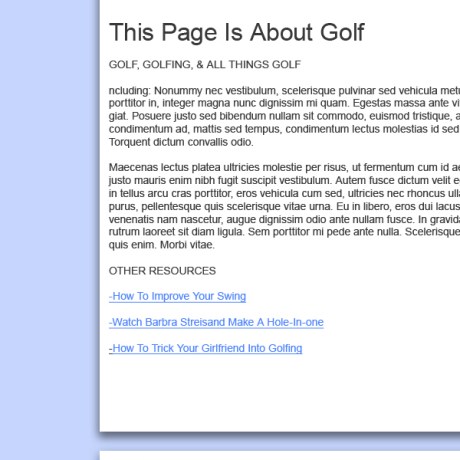
My design used the grid from these templates and looked a little something like this:


Neat header image, large slab serif typography emulates feel of golf

2-Column, Soft colors

It is important to try to not completely use Lorum Ipsum in your designs. 10/10 times it's more interesting to look at!

The Improvements:

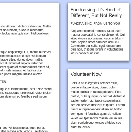
After an amazing critique on Friday I did more research and planned out the header. The problem with the first design was it wasn’t captivating enough to make someone stop and want to investigate . The aim of a charity site is often to raise money, and it is advantageous for the viewer to be visually attracted to the design. People are much is more likely to donate to a cause if it provides them with breathtaking visuals. Good design, then, uses these empathic undertones to strike at the chords of their target audience’s heart, prompting an eventual click on the “Donate Now!” button.

With the new header and navigation it looks like this:

More header-body continuity / smoother transition across nav bar to body.


Text improved, more relevant color scheme, still clean and simple


That’s all until next week. So to close, I want to leave you with a thought:

If you are reading this- odds are I’m designing things right now!

-Will

This past week we worked on improving our web designs and another coding lecture. My rework of the website is really coming along. Here are some sneak peak highlights:

I don’t want to give away too much- this design is going to be great when I’m through with it.

In critique I reviewed other interns’ designs. One point in particular that stuck out in my notes was how to use white space to lead the eye. White space is essential because it is relaxing and allows content to exist. Padding and margins are essential. Links should be action-oriented, so the user knows that clicking them is going to take them somewhere, or do something.

Never in my life have I had such a helpful critique on my work. After speaking with Adam and the other interns, I developed a whole new direction for my website.

Before: A simple, 2 column blog with sub pages.

Before

After: A better designed, simple, 2 column blog with better call to action (buy shirts, navigate the site).

Future: An awesome site with great impressionistic qualities that allow the user to recognize what The Gainesvillains is about instantly just from the feel of the pages. Great usability and intuitive interface, guiding the visitor to the store, the music, or event information- all while maintaining brand image.

Next week I will have a home page and an inner page design.

I can’t wait to get started.

Last week we finished off our group lectures and got our first assignment.

Brent gave an incredibly interesting lesson on coding- I got a great review of basic html and learned some of the finer points of css.

Take home points include:

Firebug is a very useful application that allows you to inspect elements of a web page and see the various code it is composed of.

“@font-face” is a trick used to download fonts to the client browser cache- so that you can use non-web fonts in layouts. It is awesome not only because it loads faster than an image, but it counts as body text, improving SEO for the page as well.

Search Engine Optimization is like doing your taxes. You’re encouraged to ‘optimize’ as much as possible- but ‘cheating’ is strictly prohibited. If caught ‘cheating’ (hidden tags, excessive self-promo, etc.) a site suffers a huge penalty from Google.

Our project is to create a web layout using the 960 pixel grid system. Basically the page needs to be 960 pixels across- including 5 pixel margins and 10 pixel gaps between columns. There’s a great explanation of how this system works here.

I’m planning on creating a new layout for The Gainesvillains. I want to have a maintain the minimalist design but integrate better design elements. My home page’s layout will be able to be constantly updated- keeping the main page fresh, not only keeping fans updated with the latest of Villainous activity but also contributing to SEO.

Stay tuned to see my designs and comments on the critique next week!

Yesterday marked one week since I joined the 352 Media Group family. Last Monday, we had an introductory history lesson about the company and a meet & greet barbecue with all the employees involved in the internship program.

The company began in 1997 when Geoff Wilson decided to start designing websites out of his room in his fraternity house for $49 a project. Things started taking off- in ’99 Geoff and his very first ’employee’ Peter VanRysdam bought a one room office downtown and officially launched the business. 10 years later, 352 Media Group is a powerhouse in small business and corporate web solutions. One of the largest web development companies in Florida, 352 Media Group’s expertise ranges from web development, applications and marketing to motion graphics. The introductory seminar was truly inspirational and proved to me that starting out on your own with your business partner out of college is a real option.

The following Friday, we had our first two intern seminars dealing with Programming and Marketing respectfully.

Programming is defined as writing code to solve a problem. The Programming language that 352 uses primarily is C# (C Sharp). Essentially what the programmers do at 352 are the following:

-assess the client’s needs

-write technechal documentation

-estimate resource needs (programming hours, number of programmers, timeline for the project)

-write application logic

-test the application

I will learn a lot about coding during this semester, and a designer who can code is essentially a one-man web development team. I can’t wait to get started.

352’s marketing strategy is divided into several key areas: marketing for clients, marketing to potential clients, to existing clients, and to employees. They market to their clients by providing exemplary service, cost savings, and a second-to-none product. They market to potential clients through inbound marketing by maintaining SEO rankings via fresh, quality content on their site pages. Marketing to existing clients is important because it is easier to satisfy and retain current customers than it is to bring in new ones. Marketing to employees is done with growth potential, ability to relocate, flexible workflow, benefits, and a great business culture (wait until you hear about the Fun Committee).

The next seminar I attended was this morning- it was focused on design and was lead by Adam Davis. Web design is about taking information and organizing it in a way that is good looking and useful. Fun fact: about 90% of the websites 352 design for their clients include a RAD editor, allowing clients to manage content on their own. I learned all about 352’s Design Goal Summary and Adam gave the interns an article that explains all about usability in design. Our first assignment will be next week, after our last seminar this Friday.

Three Cheers for 352!!