 Sculpture composed through layers of gears, creating a monumental clock. The quote on the arms state a quote from Herbert Hoover, “About the time we make ends meet, somebody moves the ends,” quoted during the Great Depression. The hands point towards 5 o’ clock addressing the 9:5 jobs, currently suffering in the economy. Despite these hard time workers continue on day after day, with the aspiration that one day their slice of the elusive American Dream will become a reality.
9:5
So what happens when I take something cool I see and read and jam them together with great attention to typographic detail?
Along with the celebrations across the world, the new calendar brings us a whole new year full of design inspiration.
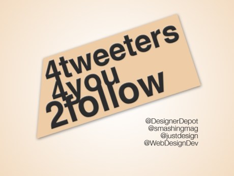
Here are the a few of the sources I follow that provide the best Web Design links and resources.
Web Designer Depot is also a blog. Their twitter not only links to their new and popular articles, but also valuable tools and resources about web design.
Smashing Media is a young and growing company publishing various online magazines as well as electronic and printed books about web design, web development and desktop publishing. Maybe one day some of us will contribute, or even work for them!
“Feeding your need for design related links!” Need I say more?
A clever play on words, Web Design Dev is the ‘division’ you can refer to when looking to expand your web knowledge.
After a semester-long hiatus, I’m back. Between classes and work, there’s been little time to spare. After having recently attended Dancegiving (which was extraordinary, by the way), I decided to create something pertaining to my experience. With this, I combined the House M.D. title font and the craziness of a house music event. Unfortunately, the typeface didn’t have numbers, so the “Hau5” acronym wasn’t available. After a little helpful criticism from Sir Newton, this is what I came up with.
Toying with layers, shapes, and conflicting font types to create a cohesive piece. Go Gators.
‘Ello everyone,
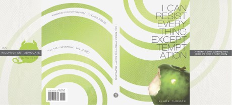
The name’s Blake, pleasure to meet & work with you. Having the summer blues of cashiering & beach failed to inspire new ideas and concepts, so I’ve spent my summer reworking old pieces, branching out from where those have evolved. The piece I am sharing is a sleeve for a thriller/dark humor novel. Originally a sequel to a previously designed book sleeve, the stylistic differences have persuaded me to portray this piece independently. I aim to design two other sleeves complimentary to this and have a trilogy display. Feedback loved.
Alright, here’s another self-study/self-portrait I finished a couple of months ago. Not really trying anything with it, just messing around and looking at different tutorials to better acclimate myself to Photoshop. I’ll be putting up some 35mm photos along with the portfolio I made for my final in Photo 1. Might take me a bit so don’t hold it against me.
-Someone said I looked like the guy from Incubus in this one. Not sure if that’s good or bad?


