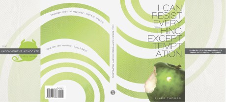
Toying with layers, shapes, and conflicting font types to create a cohesive piece. Go Gators.
‘Ello everyone,
The name’s Blake, pleasure to meet & work with you. Having the summer blues of cashiering & beach failed to inspire new ideas and concepts, so I’ve spent my summer reworking old pieces, branching out from where those have evolved. The piece I am sharing is a sleeve for a thriller/dark humor novel. Originally a sequel to a previously designed book sleeve, the stylistic differences have persuaded me to portray this piece independently. I aim to design two other sleeves complimentary to this and have a trilogy display. Feedback loved.
Alright, here’s another self-study/self-portrait I finished a couple of months ago. Not really trying anything with it, just messing around and looking at different tutorials to better acclimate myself to Photoshop. I’ll be putting up some 35mm photos along with the portfolio I made for my final in Photo 1. Might take me a bit so don’t hold it against me.
-Someone said I looked like the guy from Incubus in this one. Not sure if that’s good or bad?
Hey everyone! I’m excited about the new site and hopefully we’ll get a good group of viewers. I’m a bit ashamed, I’m actually drawing a blank on what else I should say. Awesome first post, eh? Well, regardless, here’s a vector portrait I made about a month ago. I started my first official Design class about a week ago, so bear with me.
-Andrew
I love type. Arranging letters just happens to be a passion of mine. In this image I used a great font I found, called Lobster Font. Download it here for free.
To share resources, ideas, showcase our work, and develop our abilities through collaboration.


