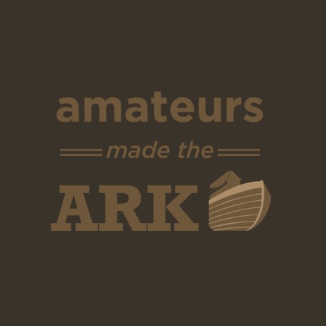
Okay, so after a long hiatus, I’m back. I’m getting settled into my job I started after graduation. A few weeks ago, I saw the quote, “Amateurs made the ark, professionals made the titanic.” I found that amusing, so I decided to break the quote and use it in a two-part, typographic exercise.
I attempted to use the typefaces as well as the color scheme to convey not only the materials used in each boat, but the circumstances in which they floated. The straight, slab-serifs and brown earthy colors relates to the rough wood used to build the ark. The script and sans-serif refer to the more modern era in which the titanic existed, while the blue color relates to the iceberg and the ocean in which the ship sank.

